Who Review can now exclusively present the second part of Alex Hewitt’s interview with Big Finish cover artist Sean Longmore. While the first part of our interview mainly covered Sean’s work from last year, in this part, Sean talks about some of the work he did for 2023 Big Finish releases.
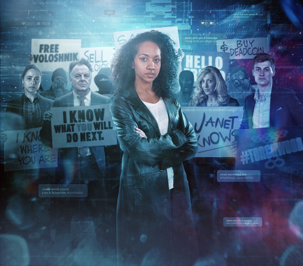
Thanks for joining us again, Sean! Your biggest project this year will undoubtedly have been Torchwood: Among Us, with an incredible fifteen artworks across the series. What was that process like?
That was bonkers, that one. I knew that bits had been recorded before I’d started working for Big Finish, and then I got an email from James Goss saying, “we’re finally going ahead with series seven,” and I sent him one back going, “I’m so excited, so excited!” and I immediately started brainstorming ideas. As it works with Torchwood, the briefs are usually very short and I don’t typically see the scripts of those in advance. James is usually excellent at giving me a very concise brief with the characters and how it should look and the vibe. We have a great working relationship in terms of being able to bounce off ideas like that.
I just got a list through with a breakdown of the characters that are in each set and basic locations, and it was kind of, “off you go – work some magic”! But it was so exciting because I’ve been listening to that range for years as well. I’ve been so invested in those characters, so to hear them finally coming back was a treat for me. I’d love to say I planned the covers all in one go but there was a lot of making it up as I went along to be honest. That first image with Gwen for the first boxset was the very first thing I put together. The individual covers came along after that. They weren’t guaranteed to happen at the time but everyone on that range has really gone the extra mile.
Those individual covers in the first boxset are kind of quite simple and I wanted to replicate what had been done with the previous two series [Aliens Among Us and God Among Us], not giving away too much about the stories. I’ve kind of just had more fun as I’ve gone on, so they get progressively more complicated as it goes on.
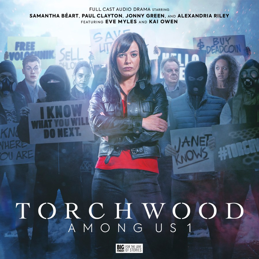
I love the cover for the final episode of the series, The Apocalypse Starts at 6PM, and how it mirrors the overall Among Us 1 cover but replaces Gwen with Ng.
Yes! I did that initial cover with Gwen – I said to Goss that we needed Eve front and centre because it was a massive thing to have her back, even for that one episode. Then James said to me that the last episode should have Ng in a ‘hero shot’, so that instantly made sense because of the connection between the characters. It was a sort of full circle moment for the whole series.
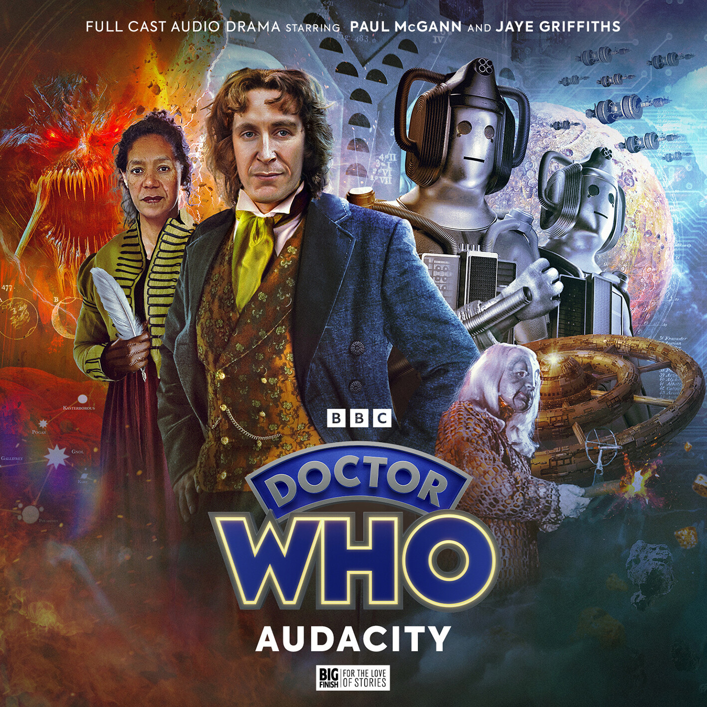
Moving on from Torchwood, the Eighth Doctor has a brand-new look in his adventures coming out later this year! How did you go about creating that?
It’s one of the hardest things I’ve ever had to do as a designer. It’s through no-one’s fault at all – there are various legal things that have unfolded through the years, and this is where we are. I got an email from David Richardson after working with him on the Fourth Doctor covers just saying, “how are you at making things from nothing? Can you create stuff without any assets?” and in my head I was thinking it might be a Big Finish original series, or something that doesn’t exist. So I told him as long as there was some stock or reference photos that I can work from, I’d happily do it. Then a couple of minutes later I got through the scripts for that first Eighth Doctor boxset [Audacity].
It was a daunting task – not only was it recreating Paul [McGann] for the right era, it was Revenge of the Cybermen Cybermen as well. There’s so few good photographs from that story, and most of it was studio-based so there’s not a lot of great film footage you can pull screencaps from. So I had to make those, and then also there was a new companion who had to be in period dress. Everything on that cover had to be made from scratch. The inspiration for the Doctor’s outfit was the Doctor Who Magazine comic run Oblivion, but the approach was to do my own thing.
Paul’s face on there is from the Minuet in Hell – David Richardson had some physical Kodak prints from when they were recording. That seemed to make more sense than taking a Dark Eyes photo because it was easier to find something that was closer to the time. The hair was a nightmare. A lot of people said it looks great, but what people don’t see is all the failed attempts I had! The trick was to look at how the wig on the movie sat on his head, and once I’d sussed that I was able to find a stock model who had very similar flowing hair, so the back is stock. The front section with the curls is very unique to that wig, but my own hair gets really thick and big and I get a front curl, so I took a photo of my own head, overlaid that, and warped it to match the shape of the original wig.
I should also shout-out Chris Thompson who designed the Cybermen! It’s absolute magic when he sends me through the renders.
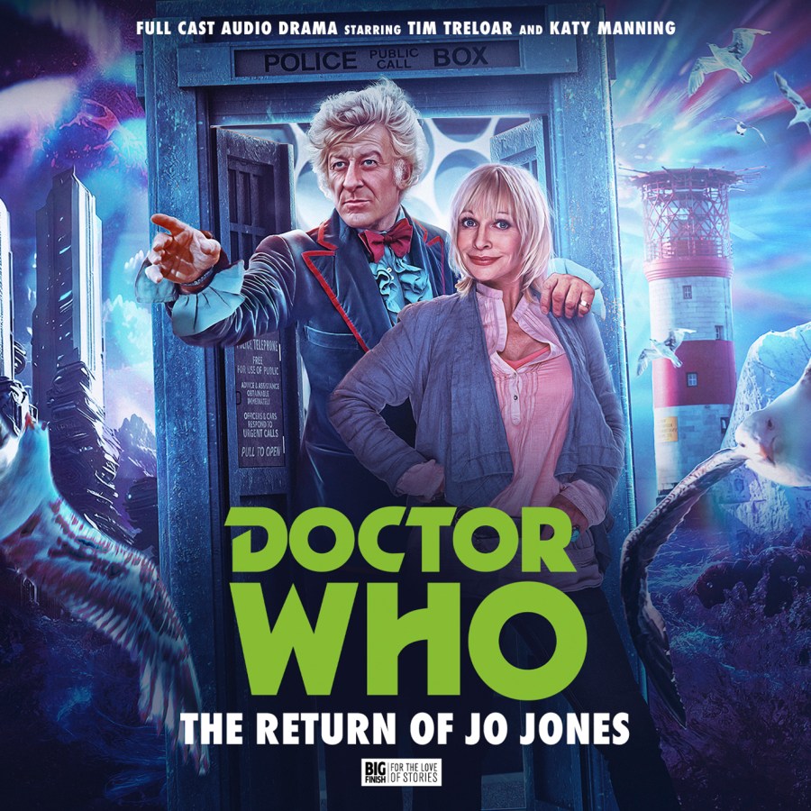
With The Return of Jo Jones and Dark Season you had to mix old photos with newer ones – what’s your process when it comes to blending photos from different sources like that?
With Dark Season I felt a bit like a kid in a sweet shop because Scott [Handcock] had arranged a photoshoot with the new cast, so I’ve got a folder with glorious shots of them looking wonderful and terrific. They were a treat to work with – when you’re building Paul McGann, or Yvonne Hartman in a prison suit, it’s great to have photos that just look magical by themselves. I used an older photo of Mr Eldridge. Scott told me he shouldn’t age as that makes him more menacing – I think he was the only older photo on that cover.
I sat on that boxset for quite a while – I’d finished the cover about a year before it came out and I had to sit on the secret of Kate Winset coming back in!
How often do you have to keep secrets?
The things I know… I know a lot that I can’t talk about, and I always get quite giddy as a fan. I get really excited for people to see things. Like, Among Us 2 with Ianto and Yvonne was brilliant and I couldn’t wait for people to see those covers.
In terms of the Jo Jones set, that was a lovely one where I was reading the scripts and just thought it was terrific. I told Heather [Challands, producer] that I wanted the cover just to look like two best friends. My inspiration was the promo campaign for Doctor Who Series 5 on TV where they just had those photos of Matt and Karen in front of the TARDIS. We got access to the photoshoot from The Sarah Jane Adventures, and I wanted to make sure that Katy Manning looked happy. Sometimes, though, it can look a bit rubbish if you just have a really smiley headshot – it doesn’t always look very dramatic, so that was something I had to bear in mind. I wanted to keep the vibe of friends reunited going on adventures.
Blending that with full-body Pertwee was a challenge – while I was making it I started wondering why I’d done this again. My style isn’t typically just headshots lined up, and there’s not that many photos of Jon Pertwee from the end of Season 10 or the start of Season 11. There are quite a few from Seasons 7 and 8, but those were all very clearly older – he’s often wearing black in those ones which he wasn’t by the time Season 10 rolled around. The easy option would have been to use something from The Time Warrior, but that green jacket has quite a distinctive cut and those shots have been used a lot. So I kind of set myself up into a really hard shopping list of what I needed.
The other thing with Pertwee is that he’s so handsome and commanding in every photo, but no two photos of him look the same. He’s got very distinctive facial features so it’s really hard to mix and match with him.
Let’s return to Torchwood for a bit to discuss some of this year’s monthlies – starting with Double!
Those covers were actually done very, very early. When I did them the scripts were still being written but my lovely brief from Goss was “Autons doing sneaky Auton things in the 1970s”. It was definitely a vibe I could work with – I love those old The New Avengers and The Professionals kind of vibe. That’s the sort of mood I was trying to work with. The stereotypical thing to do when someone says 1970s is to go disco, but when you look at the dramas from the late ‘70s they tend to be much more gritty. I wanted to replicate that feel.
Making the Autons themselves was tricky – there were modern pictures of mannequins that I put into clothes and shaped and added their hands. They’ve got a kind of James Bond vibe, which is what I love. And the double-barrelled Auton! I wanted to have an Auton you didn’t want to mess with. Then some other releases got nudged around so that one stayed quiet for a bit. I didn’t even know until it was announced that Louise Jameson was in it.
It’s brilliant that the covers so perfectly evoke the era without actually showing any of the cast.
That’s something we’re very conscious about on the Torchwood monthlies. It’s very different to doing a Doctor Who boxset when you’re taking snippets and bits from the scripts. Torchwood in its very nature is about being sleek, and sexy, and fighting aliens in a stylish way. A lot of it by design is style over substance, so we try to reflect that sleek sexiness by selling a ‘mood’ in the covers.
We’ve also had the ‘romance trilogy’ this year – tell me a bit about those ones.
The Last Love Song of Suzie Costello was one of those briefs where I was really wondering how I was going to do it. It’s so easy to get ‘underwater’ wrong – it’s so easy to just put a blue filter over someone and make it look weird. I tried to get the lighting right on that one, and the colours and ripples across Indira’s face. We had some discussion about whether she should be a diver, but there was a great weirdness about her just standing there underwater which I feel really captured Suzie’s character.
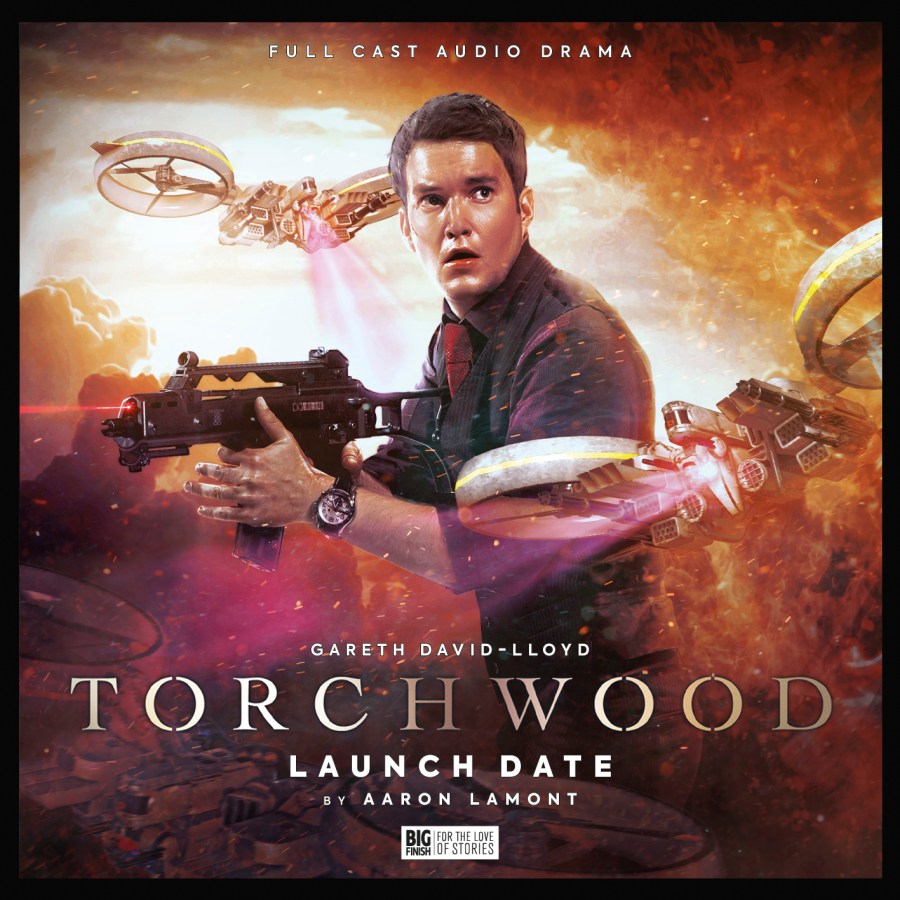
Launch Date was a treat, that particular shot of Ianto is one that I’ve always loved and wanted to put in somewhere. The thing about those Children of Earth photos is that they did a really good photoshoot with the trio brandishing guns, and there’s shots of them jumping about onto mattresses and stuff, but the ones you can find in HD have been really heavily treated with 2009 Photoshop and look quite desaturated, so I wanted to try and make it look quite realistic. That one led to a bit of an adventure to track down some photos that were missing – there was a shoot done after Series 2 to promote the BBC audios, but we managed to find some new photos. That’s where the photos of Ianto on the Among Us 2 covers are from. It’s lovely to have a whole folder of new photos.
Onto Thirst Trap – apparently there was a new photoshoot with Tom Price for this and Dog Hop. What was it like getting a whole wealth of new photos of Andy in costume?
Oh, those photos! We’d been using photos of Tom that had been taken for Ghost Mission way back when, and a lot of them weren’t great quality so I asked James if he could please hire a uniform and take some new photos. And I did not expect the glory of Tom Price staring back at me over his shoulder doing a little ‘shush’. I saw it and instantly knew that was the Thirst Trap cover – especially with Rhys juxtaposed in the back. Tom is just fantastic. It’s wonderful when an actor will have fun like that, because an actor’s not necessarily expecting to have to pose for a cover when they come in for an audio. I said to Goss that I wanted this to look like a rom-com poster. It was the right balance of Tom looking incredibly camp and Kai looking super serious in the background. This year’s Torchwoods have been a joy.

Many thanks to Sean for speaking to us. His work for Big Finish is available to view here: https://www.bigfinish.com/contributors/v/Sean-Longmore-11730.

Leave a comment